Colour Moods
Notice the difference in the colours and how it affects the feeling we get from them.
Image
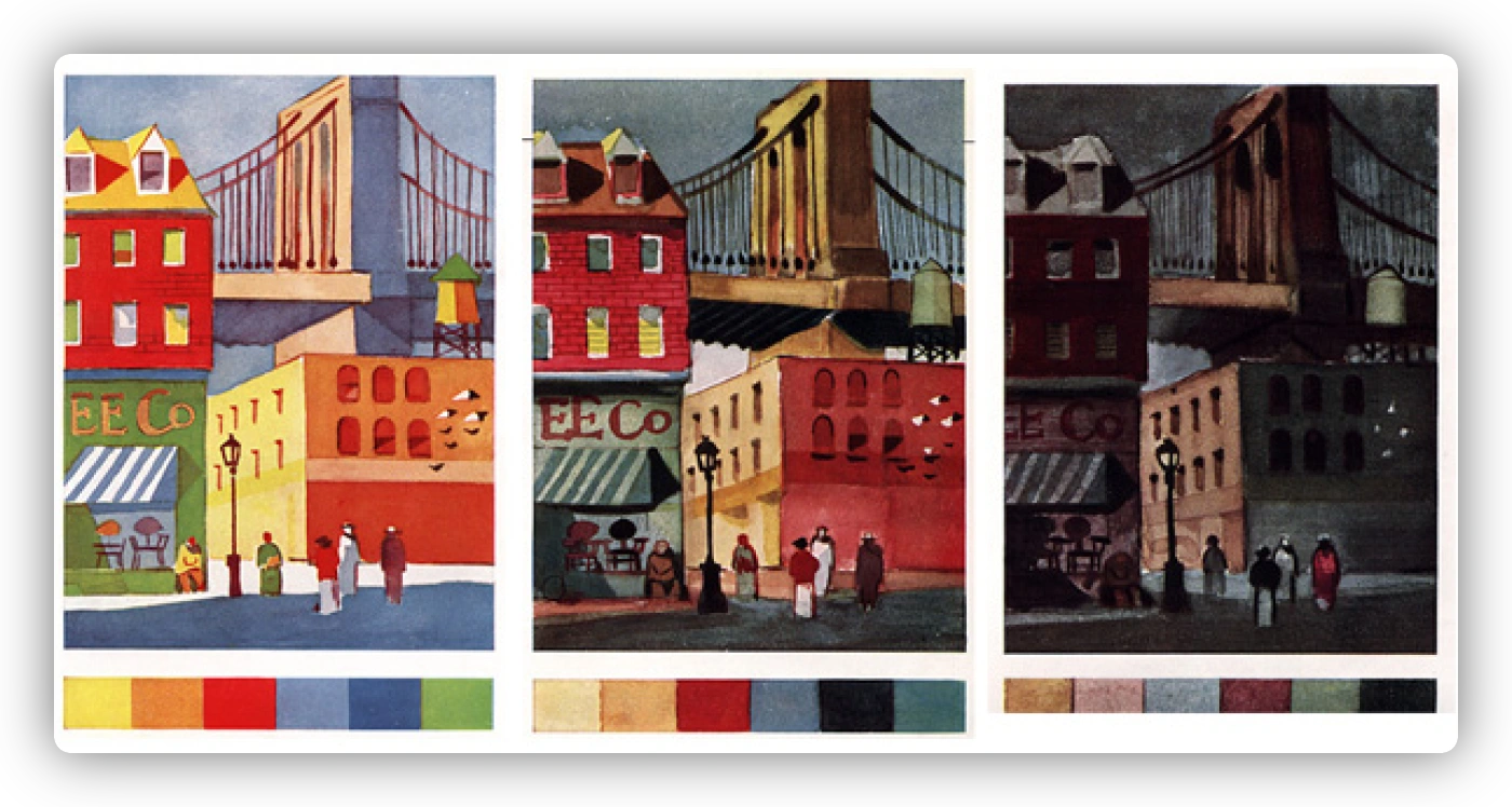
The emotional impact is affected. Colour can express emotions
Here's a partial list, can you think of others?
- Light Green - Cool, appetizing, tender;
- Dark Blue - Cold Distant, noble;
- Light Blue - innocent, coolness;
- Deep purple - exclusiveness, stability, royalty;
- Light Purple - fragrant, tender;
- Red - Excitement, fire, bold, vivid;
- Pink - dainty, feminine, delicate;
- Orange - warmth, cheer, stimulating;
- Brown - mellow, aged, weathered, tasteful;
- Maroon - rich, luxurious, quiet;
- Blue-violet - twilight, moody;
- Gray - quiet, mild, slow;
- White - clean, cold, spacious;
- Black - sober, intense, dramatic.
How colour affects us in our surroundings
| Yellow is the colour of sunshine and it's a positive, happy colour that arouses high spirits. In commercial art, it is the most readable background colour for block type or lettering. It is the popular choice for warning signs, direction signs and auto license plates, where the message must be read quickly at a distance. It is a positive selling colour in advertising design and packaging. | Violet is a pure spectral hue. It is used to enhance the packaging of certain products in the beauty field. It can represent quality, and delicacy and is often feminine. It is considered a colour of royalty because it used to be a rare natural dye. Since its symbolism has taken on a specialized meaning. It is not popular in general advertising design. Occasionally, it is used strikingly in interior design accessories. | Red is a hot colour, the dynamo whose vigorous energy arouses strong reactions. It is attention-getting and leaps out toward the viewer. In advertising and packaging, it can motivate people to buy almost any product. It is also a favourite colour for magazine covers. If used in large amounts, it can appear cheap, and people often tire from too much exposure to red. |
| Blue is a cold colour. Used alone, it can be the colour of silence, tranquillity, loneliness. It is also a respectable, trustworthy colour favourite for the logos or trademarks of banks, corporations, and insurance companies. In advertising, it is popular colour for selling products that emphasize purity and freshness. It is frequently used in interior design and the fashion apparel industry uses no other colour as much as blue. | Sometimes called chartreuse, Yellow-green can be a flashy colour or a colour that reminds people of nausea and medicine. It is not a winning colour in the field of commercial design because people have ambivalent reactions to it. The most common exception is advertising and packaging design for lawn and garden products. | Yellow-orange is also found in packaging. It is often used to impart a "touch of class" because it has a gold-like quality. In advertising and publication design, it is seldom used for lettering or title simply because it isn't strong and readable against a white background. An exception is TV title lettering, where yellow-orange can project forcefully against black. |
| As red moves toward violet, it becomes cool. Red-violet is not a popular colour in commercial art. When used as a background for black-type matter, the type does not read well. | Blue-green is also called aqua, teal blue and turquoise. It is a cool colour, a colour of freshness that is used to package products such as toothpaste, after-shave lotion, candy mints and other food, and household cleaning products. It has many of the advantages of blue without some of the negative qualities of green. | In the field of graphic design, Red-orange is often used much the same as red. It is a strong colour that will print clearly, and it is readable for type or lettering. It combines forcefully with black and white and is good all-round, positive colour for advertising, displays and packaging. |
| Blue-violet is a colour that arouses many prejudices. There is commonly a male aversion to purple; therefore, in advertising, it is used more often for feminine products, interiors and fashions. It is closely related to violet which is a colour of royalty. "Over the years, it has gone in and out of popularity in the garment and interior design fields. | Orange, another upbeat, happy colour, combines the energy of red with the sunniness of yellow. it symbolizes many pleasant things, such as fruit ices and Halloween pumpkins. Most people react favourably to orange. It communicates powerfully in advertising and publishing and is especially popular on packages for baked foods. In interior design, it is usually used with restraint. | Green is nature's colour, restful and friendly. It can be cool and soothing, harsh and brassy. It is the colour of apples, lines and mint - but also of mould, bile and slithery creatures. People have strong reactions to green, both pros and cons. It is not a popular colour in advertising, publication design, and packaging. Interior designers use it effectively in light values as a background. |
Call or text: